DSAR - Domains Configuration
DSAR -- Domains Configuration
A domain must be configured immediately after a tenant is created using the Domain Configuration option. All tenant-related operations will then be managed based on the domains associated with it.
Users who have access to a specific domain can only view DSR (Data Subject Request) requests related to that domain. They will not have visibility into other module data unless they are granted access to the main tenant. This restriction applies exclusively to the DSAR (Data Subject Access Request) module.
To create a new domain,
- Log in to the Data Governance Tool.
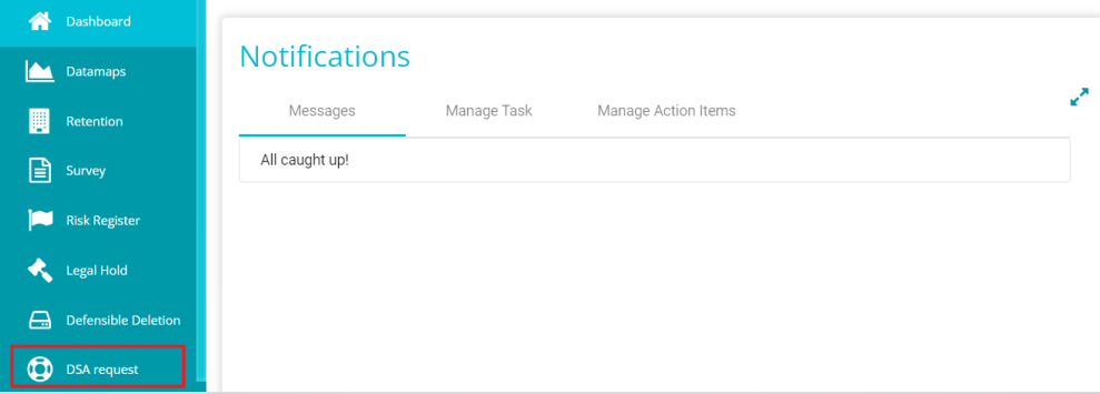
Once logged in, the Data Governance Tool displays the Main Screen.
- Navigate to the DSA Request module on the hamburger menu.
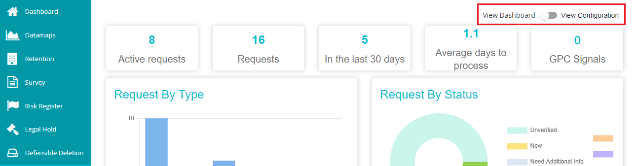
- Toggle the 'View Dashboard' button to 'View Configuration' to see the DSAR configurations.
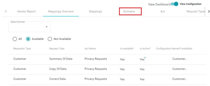
- Navigate to the 'Domains' tab on the DSAR Configuration screen.
- Click on "New".

- Provide a 'Display Name' and 'Identifier' for the domain.
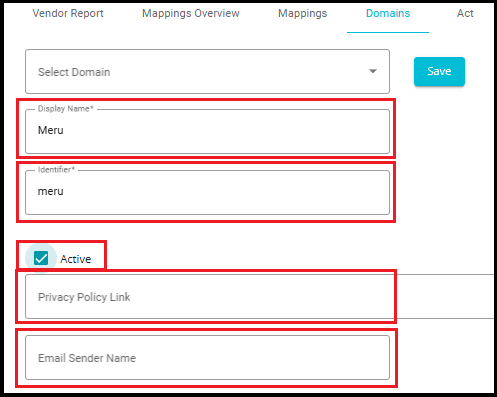
Display Name -- the name used for display purposes, through which you can identify the domain. Display name can be defined however you like, irrespective of the letters' case. You can also use special characters if needed.
Identifier -- this is used to identify the domain in the backend. An identifier cannot be in capital letters and cannot be a duplicate (shouldn't match with any other domain's identifier). Also, you cannot use special characters, symbols, etc.
Note: Display Name and Identifier cannot be left blank when configuring a domain.
Enter the 'Privacy Policy Link' in the dialog box, if needed or wish to publish it in Privacy Portal.
Likewise, provide any Name in the 'Email Sender Name' dialog box. Every Internal/External mail being sent will be sent with this name.
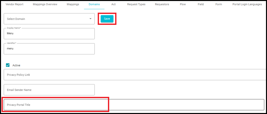
Type in the title for the privacy portal in the 'Privacy Portal Title' dialog box.
Click on 'Save'.
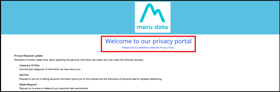
Note: The Welcome Page is where the customers can place their requests to the company.
The domain configuration provides the following changes:
Logo
Privacy Portal Layout Configuration
Privacy Portal Messages
Privacy Portal Theme Configuration
Privacy portal links
Privacy Portal Title Configuration
Privacy Portal Recaptcha Text
Privacy Portal Request Sequence
- Upload Logo
For uploading a logo to be displayed on the welcome screen,
- Click on
 next to the Upload Logo.
The screen displays the files present on your device. You can select the logo for your domain screen from here.
Click 'Open' after selecting the logo.
Click 'Update' button after making these changes.
You can see the logo being displayed on the Privacy portal's Welcome Screen.
The logo display position in the Privacy Portal is configurable via the Privacy Portal layout and can be aligned to the Left, Centre, or Right.
Supported formats -- svg, jpeg, jpg, and png.
Size -- image file size should be less than 1mb.
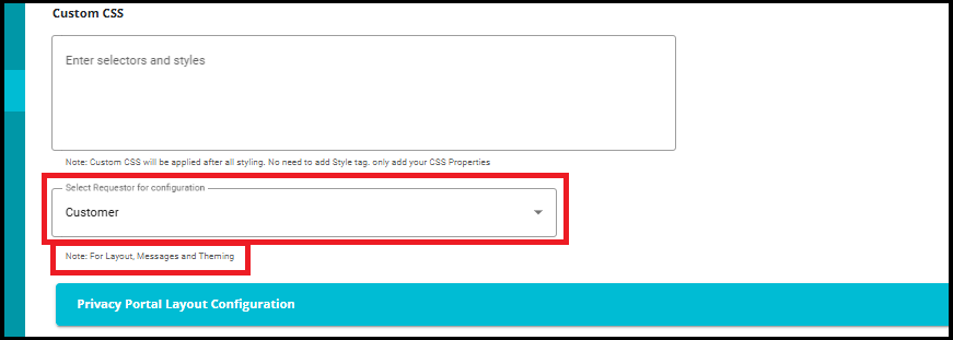
2. Select Requestor for Configuration
The "Select Requestor for Configuration" feature in the Domains tab allows you to define custom configurations for different types of requestors---such as customers, employees, or others.
- Instead of applying a single, universal configuration to all DSAR forms, this feature enables requestor-specific customization.
Note: The Requestor field applies only to layout, messaging, and theming configurations in the Privacy Portal. Any additional configurations---such as links, page titles, reCAPTCHA settings, request sequence --- must be configured individually.
Offers greater flexibility and personalization for different user experiences.
Ensures that employees and customers see relevant content and styling tailored to their context.
Helps organizations maintain branding consistency and clarity of communication across different user groups.
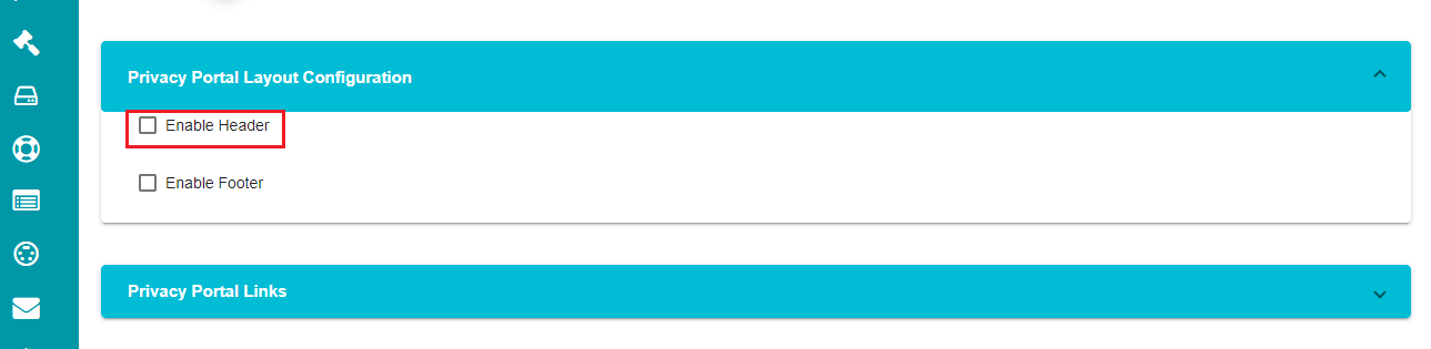
3. Privacy Portal Layout Configuration
The header and footer for the welcome screen can be configured under this setting. You can change the logo position and background color for the header. Likewise, you can add text to the footer, change its background color, and modify the footer's alignment.
- Click on
 against the 'Privacy Portal Layout Configuration' tab.
You can see two options on the screen -- Enable Header and Enable Footer.
- Check the 'Enable Header' option on the screen.
- Click on against the 'Page Header Configuration' tab.
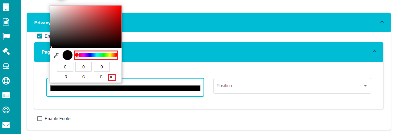
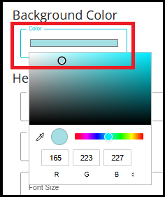
Click on the 'Background' option. You can see a color palette appearing on the screen to choose the required background color.
Choose the required color from the palette.
Note: There is an arrow to change the color format between RGB, HSL, and HEX.
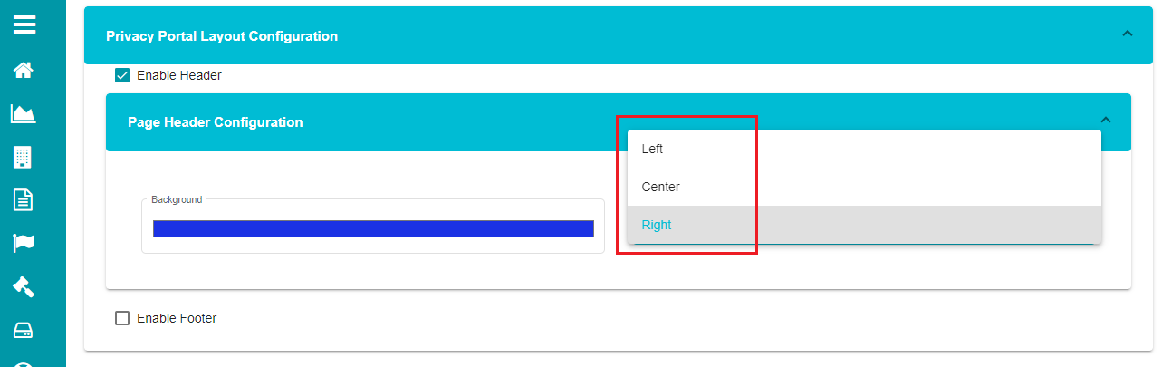
Open the position drop-down menu and choose the required position for the header.
The background color and alignment (left, center, right) settings in page header configuration tab do apply only to the logo.
Note: Uncheck the enabled header option if you don't want to customize it.
- Check the 'Enable Footer' option on the screen.
You can keep any text as well or add any important link if needed.
NOTE: The footer is intentionally left blank, allowing users the flexibility to add their own content---such as notes or links.

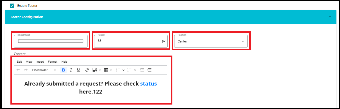
- Click on against the 'Footer Configuration' tab.
Note: you can define the background and position for the footer just like in the header. And additionally, you can also click Status here to view the status.
Use the 'Height' option if you want the footer to appear at a specific height.
Add the text to the content field if you want any text to be displayed on the footer.
Note: Content tab provides different options to customize the text at requirements.
Edit -- Allows basic text actions such as undo, redo, and select all content.
View -- Used to view visual aids.
Insert -- Used to add elements such as image, hyperlinks, horizontal lines, or other supported objects into the content.
Format -- to make the text bold, in italic, and format it through different options like background, alignment, etc.
Help - Provides quick guidance and information about CKEditor usage and available features.
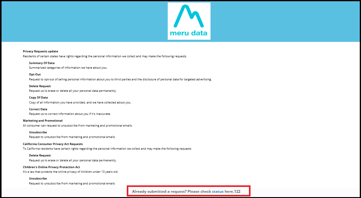
Based on the selection, the footer appears in the following way on the welcome screen.
- Privacy Portal Messages
You can use this configuration to display messages at different stages of DSA request. These messages can be seen by the user submitting the request, so you can configure anything that you want to display.
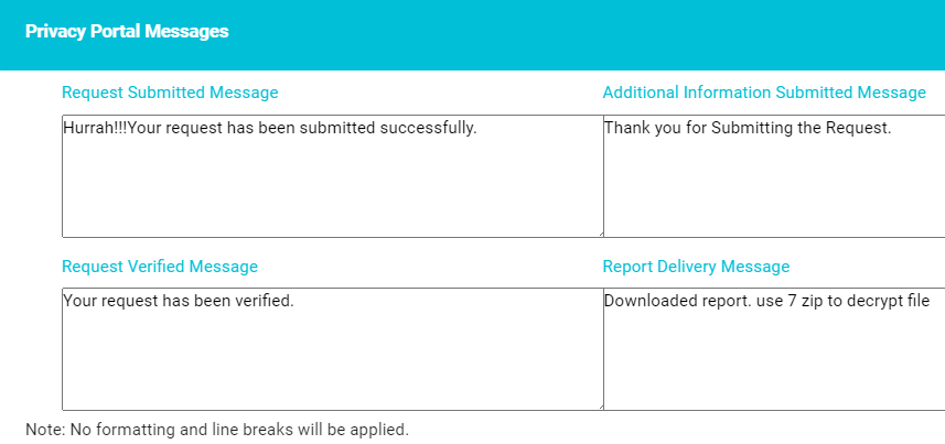
Request Submitted Message -- this message is displayed to the user right after the user submits a DSA request through your privacy portal.
Request Verified Message -- the user receives a confirmation email after submitting a request. The email contains a link asking to verify the email address. This message would be displayed to the user on the screen after they click on the link and verify the email address.
Additional Information Submitted Message -- sometimes, additional information might be needed from the user to process their DSA requests. In that case, an email is sent to them with a link asking for the required information. This message is displayed to the requestors after they submit the required additional information through the link emailed to them.
Report Delivery Message -- you can configure this message if you want to display a message to the requestor after they download the report (related to their DSA request) using the link emailed to them.
- Privacy Portal Theme Configuration
This configuration can be used for the domain Welcome Page and privacy form, and customize the theme, font styles, backgrounds, etc., of the welcome screen and privacy request form for a particular domain.
For Welcome Screen,
- Click on against the 'Privacy Portal Theme
Configuration' tab.
The screen displays two options here for configuring the Welcome Screen and Privacy form separately.
- Check the 'Configure Welcome Page UI Elements' box.

The screen displays a drop-down form for configuring the welcome screen UI elements.
- Click on against the 'Welcome Page Configuration' tab.
Here, the screen shows different options like font, background color, title, etc. These changes are reflected on the domain's welcome screen. You can configure each of these options and decide how your domain welcome screen should appear to your users.
Under the Font section,
Open the drop-down menu of the 'Font Family'.
Select the required font.
Click on 'Font Size'.
Enter the required Font Size for the welcome screen.
Click on the 'Color' tab.
Drag the cursor on the color palette or click on the required color to change the color.
Open the 'Font Weight' drop-down menu.
Select the required font style, i.e., bold or normal from the menu.
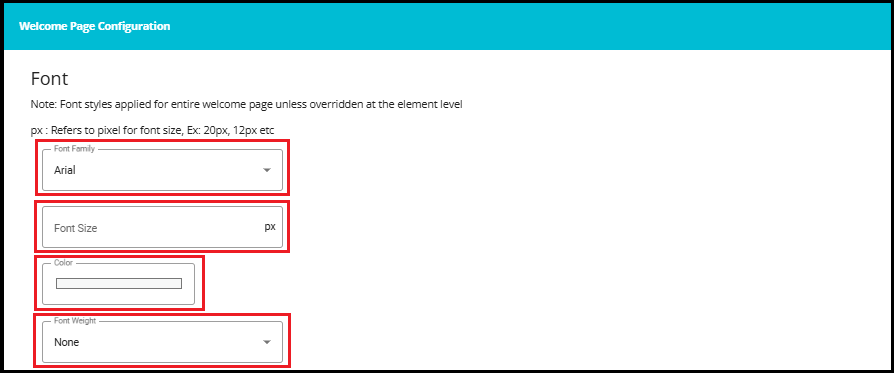
Note: The configurations made under Welcome Page Configuration apply to the entire text displayed on the Privacy Portal welcome screen by default. These settings can be overridden at the individual level if specific styles are defined under Header, Title, or Subtitle sections.
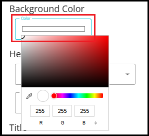
Background:
Click on the 'Background Color' tab.
Drag the cursor on the color palette to change the background color on the welcome screen.
The welcome screen's background color gets changed to the selected option once the changes are updated.
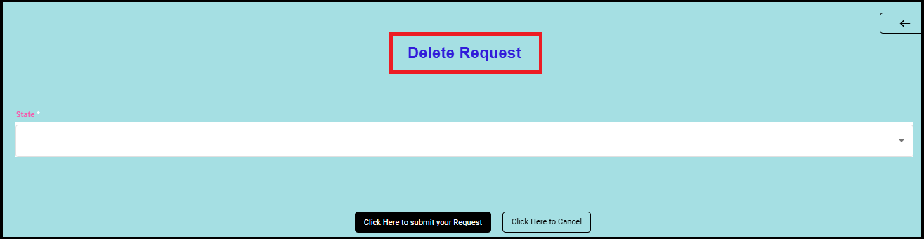
Header:
Open the drop-down menu under the 'Font Family' option of the Header tab.
Check the required font.
Drag the cursor on the color palette to change the display color of the header.
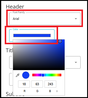
The header here is the title of the domain's welcome screen. Any changes made here are reflected in the Welcome Screen's title.
Title:
Open the drop-down menu under the 'Font Family' option of the Sub Header tab.
Check the required font.
Drag the cursor on the color palette to change the color display.
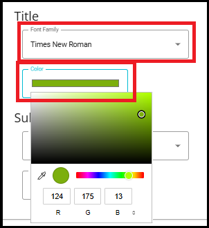
The title here refers to the sub-headings (form names and Acts) displayed on the domain's welcome screen. Any changes made here are reflected on the Welcome Screen.
Subtitle:
Open the drop-down menu under the 'Font Family' option of the Subtitle tab.
Check the required font.
Drag the cursor on the color palette to change the display color of the subtitle.
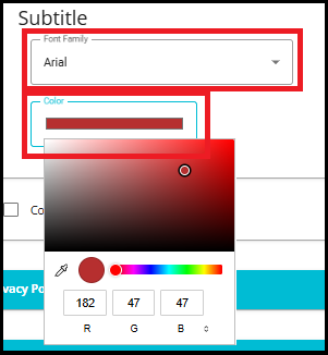
The sub-title here refers to the descriptions defined below for the titles displayed on the domain's welcome screen. Any changes made here are reflected on the Privacy Portal Welcome Screen.
Note: Unchecking the 'Configure Welcome Page UI Elements' option and updating this change will mark all these settings to the default configuration.
For that,
Uncheck the 'Configure Welcome Page UI Elements' option.
Click on

For Privacy Form,
Click on
against the 'Privacy Portal Theme Configuration' tab.Check the 'Configure Privacy Form UI Elements' box.
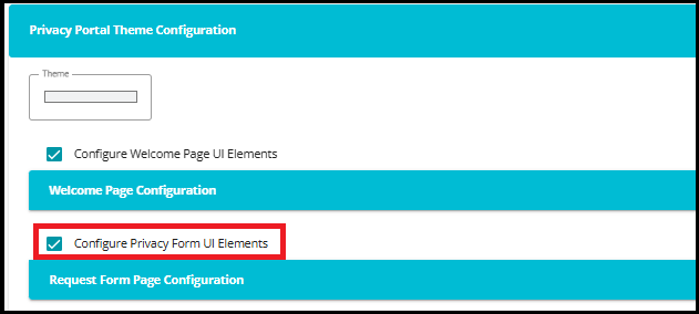
The screen displays a drop-down form for configuring the privacy form's UI elements.
- Click on against the 'Request Form Page Configuration' tab.
Here, the screen shows different options like font, background color, title, etc. These changes are reflected in every request form associated with the selected domain. You can configure each of these options and decide how the privacy request forms should appear to your users.
Under the Font section,
Open the drop-down menu of the 'Font Family'.
Select the required font.
Click on 'Font Size'.
Enter the required Font Size for the privacy form.
Click on the 'Color' tab.
Drag the cursor on the color palette or click on the required color to change the color.
Open the 'Font Weight' drop-down menu.
Select the required font style, i.e., bold or normal from the menu.
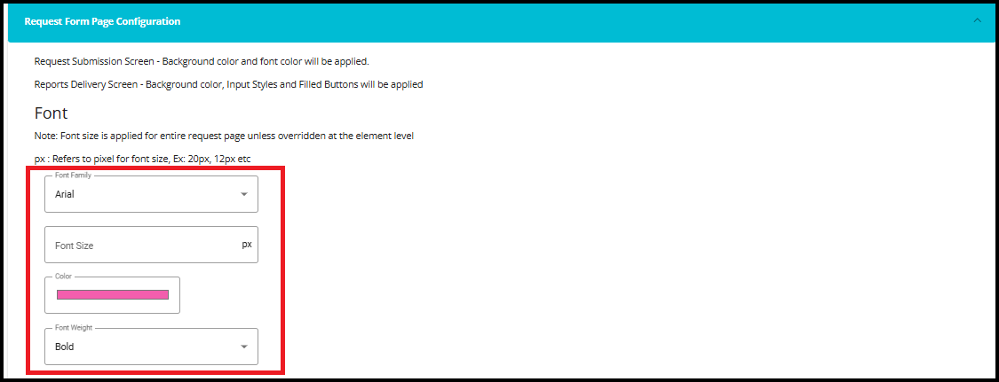
Note: The changes made here are reflected in the entire text displayed on the privacy request forms.
Background:
Click on the 'Background Color' tab.
Drag the cursor on the color palette to change the background color on the request form.
The request form's background color gets changed to the selected option once the changes are updated.
Header:
Open the drop-down menu under the 'Font Family' option of the Header tab.
Select the required font.
Drag the cursor on the color palette to change the display color of the header.
Enter the required Font Size for the header.

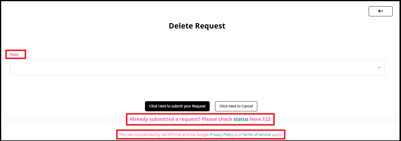
The header here is the title of the request form (which is usually the request type name). Any changes made here are reflected in the request form's title.
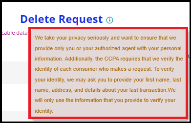
Sub Header:
Open the drop-down menu under the 'Font Family' option of the sub-header tab.
Check the required font.
Drag the cursor on the color palette to change the display color of the sub-header.
Use the Font Size option to define the sub-header's size.

The sub-header here refers to the description appearing below the title of the request form. Any changes made here are reflected on the request form.
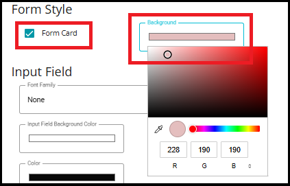
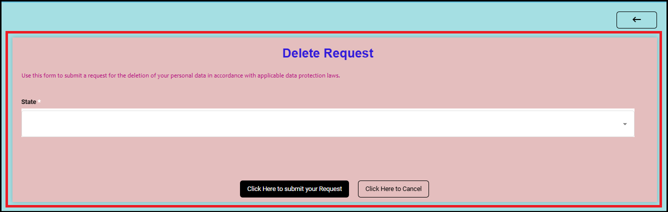
Form Style -- can be used to customize how the request form appears to the user.
Check the Form Card option if you want the request form to appear as a card.
Choose the required background for it by clicking on the Background option.
Based on this selection, the request form would appear like this:
Input Field:
The input field here refers to the different input fields defined on the request form. Any changes made here are reflected in the request form.

Open the drop-down menu under the 'Font Family' option of the Input Field tab.
Check the required font.
Click on the 'Input Field Background' palette.
Drag the cursor on the color palette to change the background color of the input field.
Change the input field's display color in a similar way using the 'Color' option.
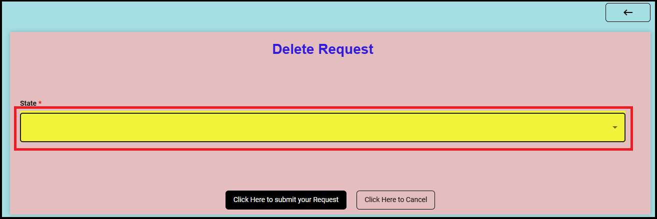
- Use the Mandatory Asterisk Color option if you want to change its color on the form input field.

- The hint's color can also be changed here, through the Hint Color option.

Tooltip:
Tooltip changes are possible if the chosen form has a defined tooltip.
Click on the 'Background Color' under the Tooltip option.
Choose the required color from the palette.
Similarly, customize the 'Font Color' of the Tooltip.
Open the 'Font' drop-down menu and select the required font.
Click on the 'Font Size' dialog box.
Choose or type the required font size for the tooltip.

The changes are reflected on the selected form if applicable.
Filled Button:
Click on the 'Color' under the Filled Button option.
Choose the required color from the palette.
Open the 'Font Family' drop-down menu and select the required font.
Click on the 'Font Size' dialog box.
Choose or type the required font size for the Filled button.

Filled Button refers to the submit button on the request form page. The changes made here are applied to the Submit button on the request form.
Default Button:
Click on the 'Color' under the Default Button option.
Choose the required color from the palette.
Open the 'Font Family' drop-down menu and select the required font.
Click on the 'Font Size' dialog box.
Choose or type the required font size for the Default button.

Default Button refers to the cancel button and back button on the request form page. The changes made here are applied to the Cancel button on the request form.
Note: Unchecking the 'Configure Privacy Form UI Elements' option and updating this change will mark all these settings to the default configuration. For it,
Uncheck the 'Configure Privacy Form UI Elements' option.
Click on
- Privacy Portal Links Configuration
This configuration is used to display hyperlinks of privacy policies related to different requestor types. For example, if the customer is accessing the domain welcome screen, they can use these configured hyperlinks to check the privacy policies related to other requestor types (say employee). This option allows the configuration of multiple hyperlinks in a single request form with the same display name.
Note: In general, the Privacy portal links are configured below the Display Name and Identifier. This configuration is useful if you want to differentiate the links for different requestors or different forms.
Click on
against the 'Privacy Portal Links' tab.Click on
 to define new variables for the portal links.
The screen displays two options to configure privacy portal links for different requestor types within the same request form.
- Define a name/placeholder in the 'Placeholder' dialog box.
Note: Placeholders don't have a specific format for being defined, but they should be defined within '[ ]' braces for them to be considered placeholders for the specified links.
- Enter the required URL in the 'Link' dialog box.
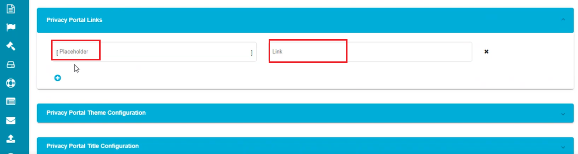
- Click on to save the changes.
The name defined under the placeholder dialog box now becomes the variable for the defined URL, and the hyperlink appears whenever the variable is used in a request form's description. Multiple variables can be configured using this option.
Note: In case of not defining any variables under the privacy portal links and a variable is defined in the request form's description in the Form Configuration screen, the defined variable takes the default link given by the user when creating the domain.
- Privacy Portal Title Configuration
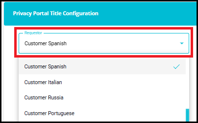
The privacy portal's title (header displayed on the welcome screen) can be configured in this section. For multiple requestors, you can differentiate the title by changing the requestor type.
Click on
against the 'Privacy Portal Title Configuration' tab.Click on
to configure the title on the domain welcome screen.Open the 'Requestor' drop-down menu.
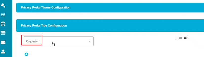
- Select the requestor type from the Requestor drop-down menu.
- Mark the
 button to make the changes.
The screen displays a tab with different options like File, Edit, etc., to customize the portal's title.
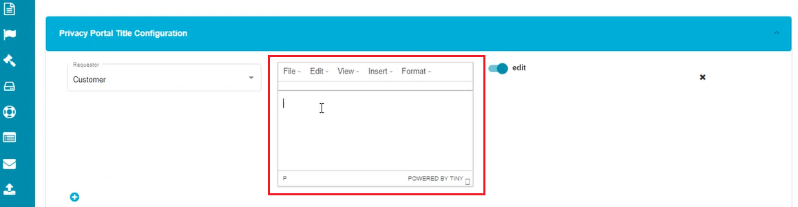
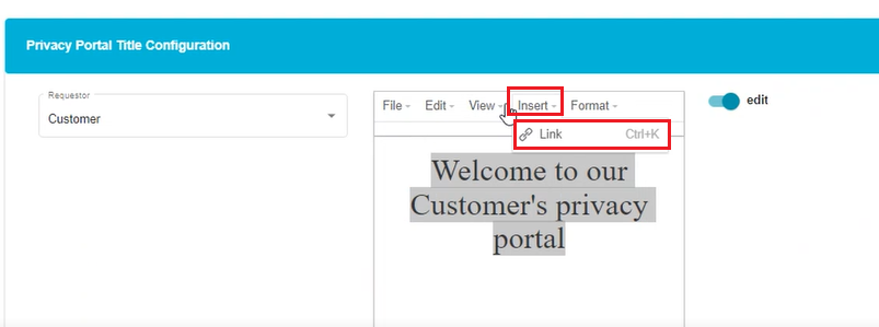
- Enter the text to be displayed as the title.
Note: Select the text before applying any changes to it.
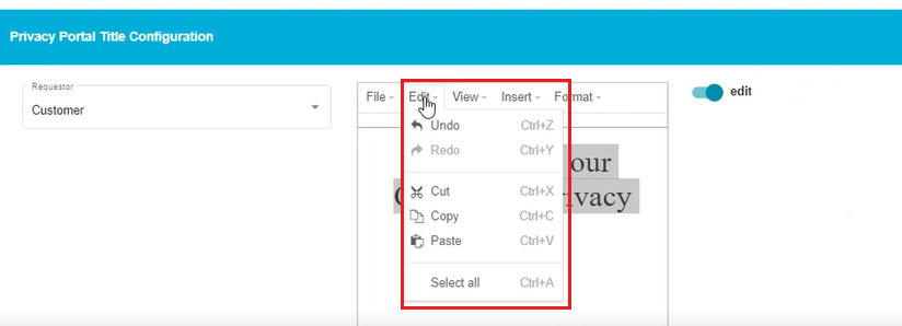
Use the 'Edit' drop-down menu for different customizations like Cut, Copy, etc.
Use the 'Insert' option to include a hyperlink to the title.
- Click on 'Format' to open the drop-down menu.
The screen shows a drop-down menu with different selections like Bold, Italic, Underlined, Blocks, Align, etc.
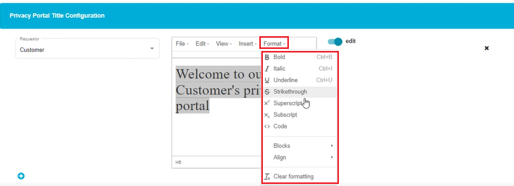
Select the required font style from Bold, Italic, and Underlined.
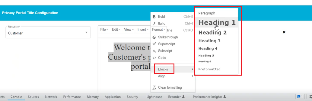
Use the 'Blocks' option to vary the font size and its appearance on the screen.
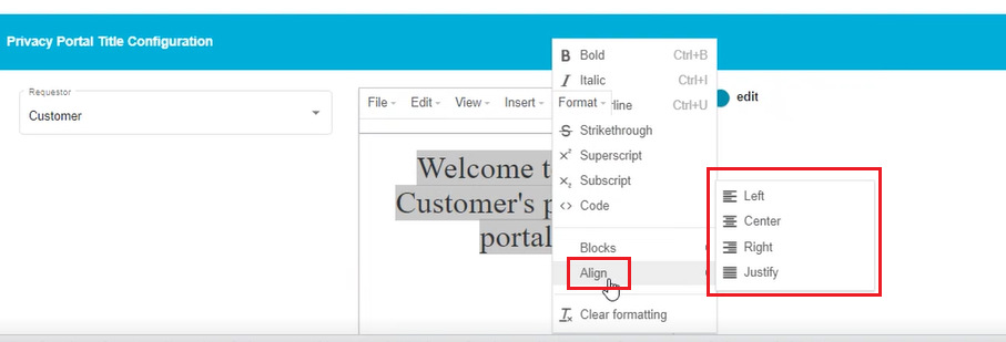
- Align the text in the center, towards the left or right using the 'Align' option.
Note: There is a 'Clear Formatting' option in this menu which can be used to clear the entire formatting applied to the selected text.
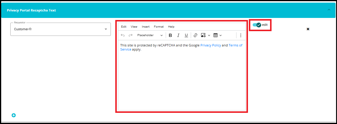
- Portal Recaptcha Text
- The Privacy Portal Recaptcha Text feature allows you to configure the reCAPTCHA message for multiple requestors, ensuring users see text appropriate for their language or region.
Note: If no reCAPTCHA text configuration is provided for a requestor, the reCAPTCHA text will be displayed in English by default.
- Click on the "+" icon to configure the Recaptcha text that will appear on the Privacy Portal Welcome Screen for the selected requestor type.

- Select the requestor from the dropdown for which you want to edit the reCAPTCHA text.
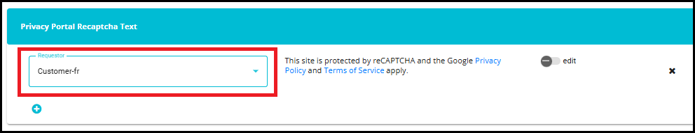
- To edit the Recaptcha text, enable the Edit toggle.
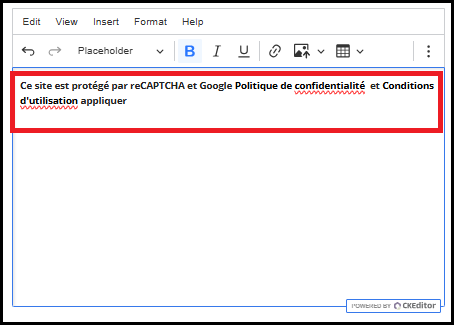
Translate the text into the required language using a translator. It will not be translated automatically --- you must translate it manually and paste it into the edit box.
For example, if the reCAPTCHA message needs to be displayed in French, use any translator to convert the English text into French, then copy and paste the translated text here.
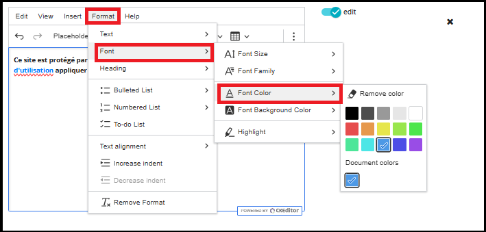
- To differentiate the link or make it easily identifiable, change the color of the word by using: Format → Font → Font Color.
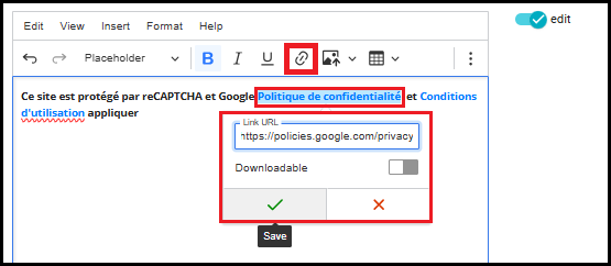
To make a word a clickable link:
Select the word that you want to convert into a hyperlink.
Click the Insert Link icon on the toolbar.
In the Link URL field, paste the required URL.
If needed, you can also toggle the Downloadable option to specify whether the linked content can be downloaded.
Click the ✔ (Save) button to apply the hyperlink.
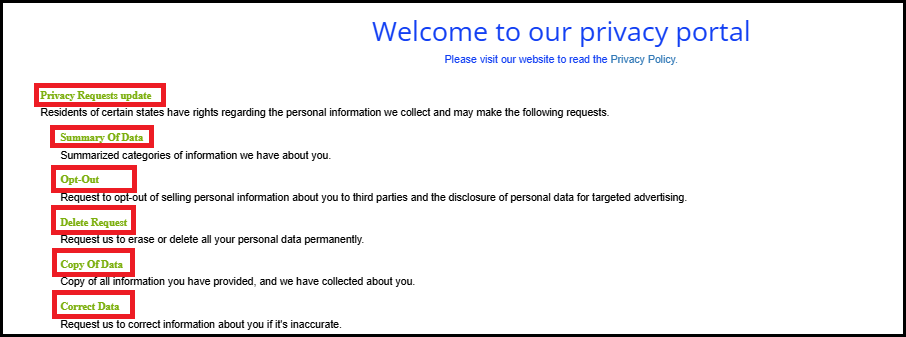
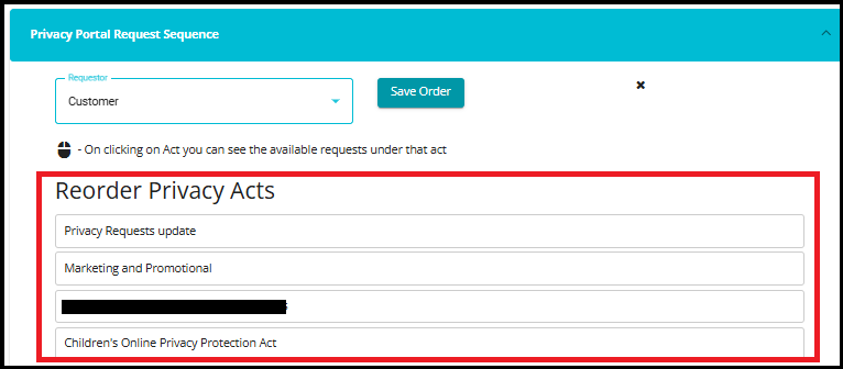
- Privacy Portal Request Sequence
This feature allows you to control the order in which different Privacy Acts and their corresponding Privacy Requests appear for each Requestor Type (Employee, Customer, Vendor, etc.).
Click on the "+" icon to configure the Privacy Portal Request Sequence.

- Choose who is making the request (Requestor Type).

- Arrange the Privacy Acts in the order you want
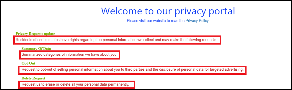
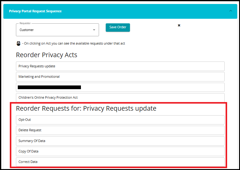
When you click on a Privacy Act (for example, "Privacy Requests update"), the system shows all the privacy request types that belong to that Act. These may include:
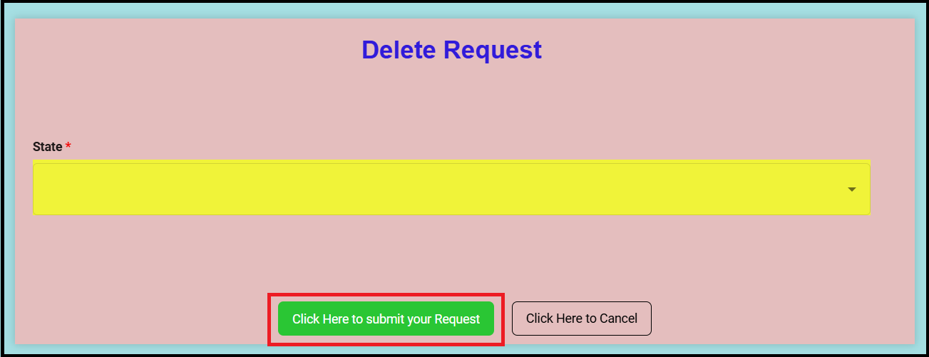
Summary of Data, OptOut, Delete Request, Copy of Data, and Correct Data.
You can drag and drop these request types to arrange them in the exact order you want users to see them in the Privacy Portal.
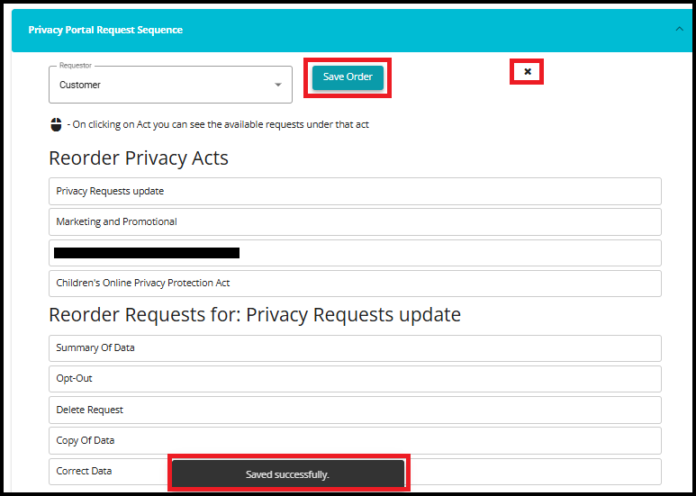
Once you finish arranging them, click Save Order to apply the updated sequence.
If you want to delete the sequence, click on the "X" icon.
- Click on to save the changes.