DSAR - Form Configuration
Overview
The privacy portal is where a user can place the Data Subject Access Requests. A user can make different types of requests based on the request forms configured. The Form tab under the Privacy Portal Configuration screen of the DSAR Configuration lets you create different forms for each request type and for each requestor separately.
To create a Form,
Log in to the Data Governance Tool.
Once logged in, the Data Governance Tool displays the Main Screen.
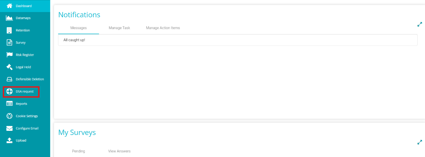
Navigate to the DSA Request module on the hamburger menu.
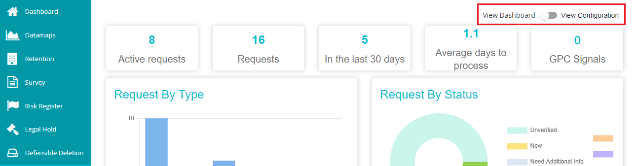
Toggle the 'View Dashboard' button to 'View Configuration' to see the DSAR configurations.
Go to the 'Form' tab.
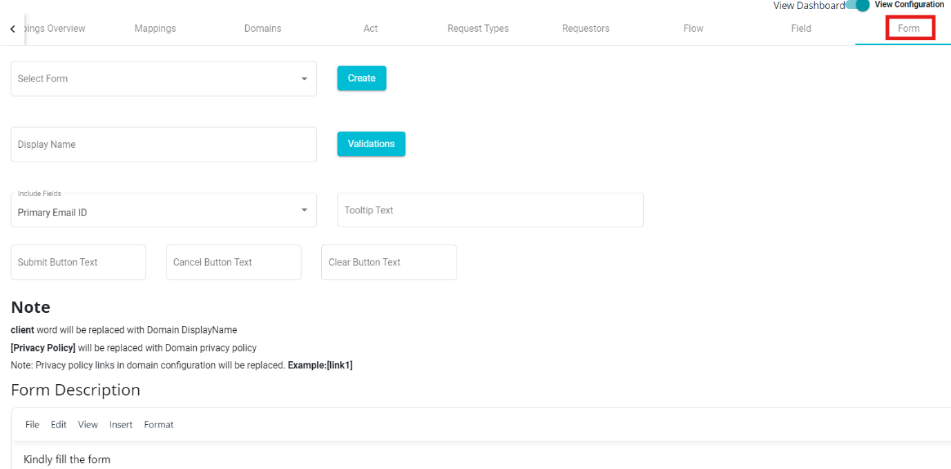
In case you want to choose from the existing form,
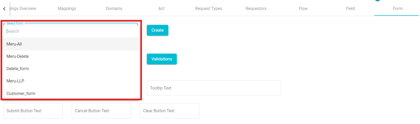
• Click on the 'Select Form' dialog box.
• Select any of the forms from the drop-down menu.
• Click on
 to make the changes.
Similarly, to define a new form,
• Click on  option present next to the Update button, to create a new form.
• Enter the 'Display Name' on the screen.
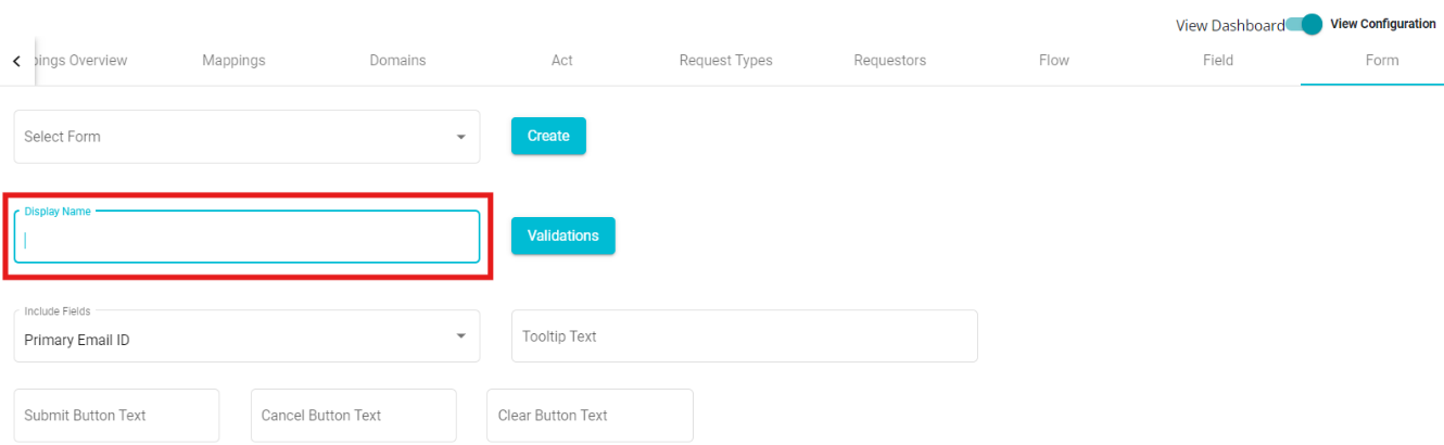
• Click on the 'Include Fields' drop-down menu.
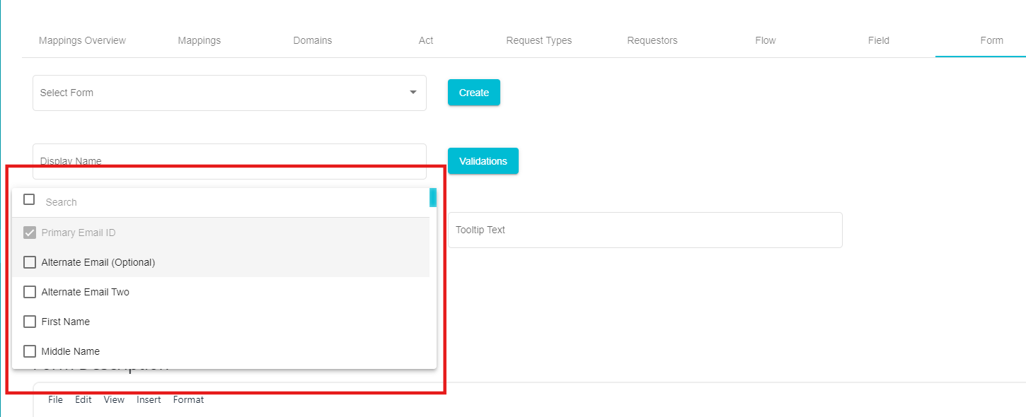 Here, you can see different fields that can be included within the form.
You can select any of these options from the menu.
Here, you can see different fields that can be included within the form.
You can select any of these options from the menu.
- Check the required fields from the drop-down menu.
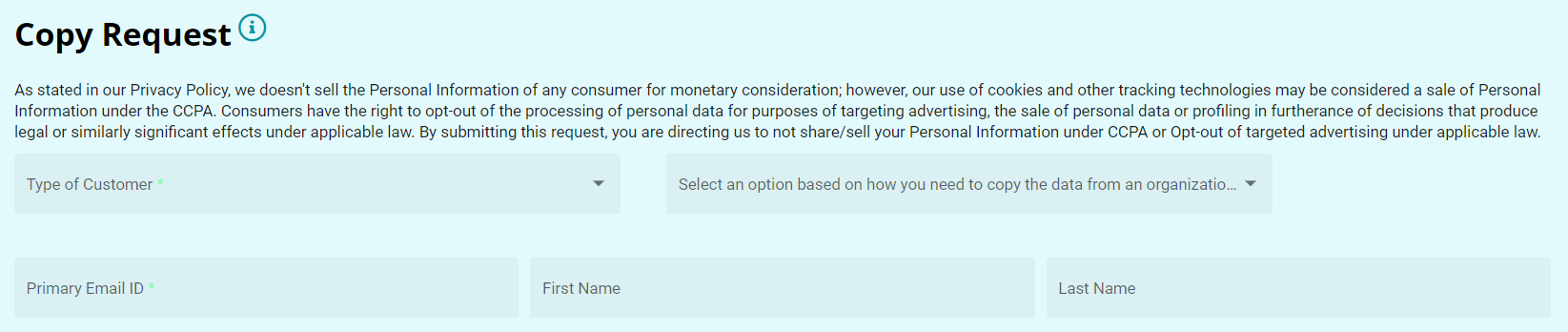
A new form is created for the domain. You can see the form's preview on the screen. After configuring a form, you can include or exclude any fields from it.
To include more fields,
• Click the 'Include Fields' drop-down menu.
• Mark the fields you want to include.
• Click  To exclude existing fields,
• Click the 'Include Fields' drop-down menu.
• Uncheck the fields you want to remove from the form.
Note: If any field is under 'Rules,' it cannot be excluded until the rules are removed for that field.
• Click 'Update'.
Tooltip Text:
Another option on the Form Tab is the ToolTip Text present next to the 'Include Fields' option. When this option is defined, an 'i' button can be seen next to the title of the Request Form. Placing the cursor on this icon displays the message typed in the Tooltip Text box. To define it,
• Click on the 'Tooltip Text' box.
• Type the message to be displayed.
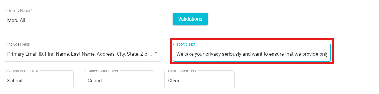
The same message gets reflected on the request form and can be seen by the user whenever they open the request form to place a service request.
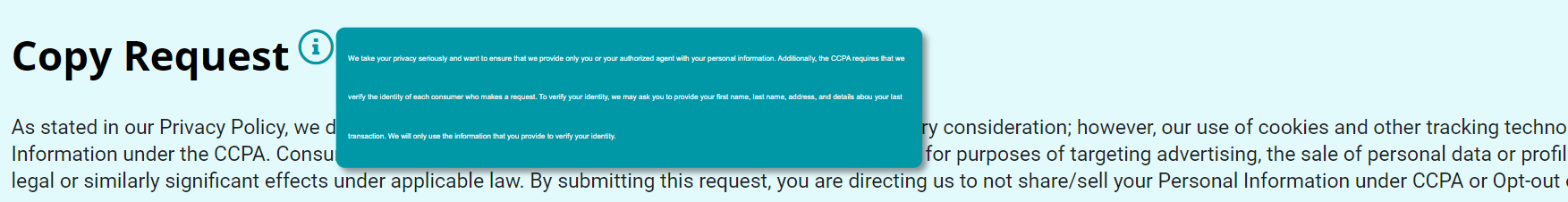
If you delete the Tooltip Text and Update the changes, the tooltip button automatically disappears from the form.
Form Description:
This option can be used to provide a description below the title of the Request Form. To do so,
Click on the 'Form Description' box.
Type the message to be displayed.
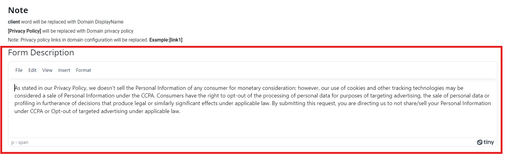
This tab also provides the following options for formatting the form's description.
File -- a drop-down menu with a new document option to erase the existing description and start a new description.
Edit -- a drop-down menu with Cut, Copy, Paste, and different options to format the text.
View -- can be used to view visual aids linked to the form
Insert -- can be used to hyperlink to any URL or links to the description.
Format -- a drop-down menu with Bold, Italic, Underline, and various other options to format the description.
The description can be seen below the title of the request form once the changes are updated. Delete the text in this box and update the changes to remove the message.
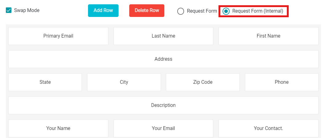
Swap Mode:
The Form tab provides another option 'Swap Mode.' Using this, you can swap different fields in a row or between different rows.
To enable Swap Mode,
• Check the 'Swap Mode' button.
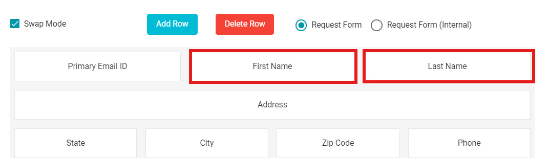
You can now swap the fields in a row on the defined form. Just drag and
drop the desired fields within a row or between different rows to swap
their positions.
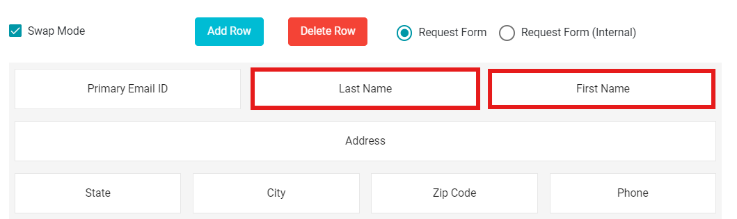
Note: Unchecking the Swap Mode disables the swapping option between two fields. In this case, the dragged field is embedded into the row alongside the other fields, instead of swapping.
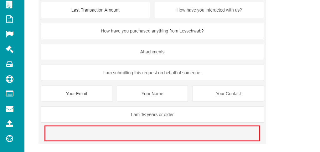
Add and Delete Rows:
You can add numerous fields to your form. However, if the form is full and you need more space to create new fields, you can use the Add Row option.
• Click on  button present next to the Swap Mode
button.
button present next to the Swap Mode
button.
This selection provides you with an empty space on the form to create more fields.
 Likewise, if you want to delete a row, you can use the Delete Row
option.
Likewise, if you want to delete a row, you can use the Delete Row
option.
• Click on  button present next to the Add Row button.
This selection deletes the empty space from the form.
Request Form and Request Form (Internal):
The Form tab provides two options -- Request Form and Request Form (Internal) when configuring it. These options are present next to the Delete Row option, and you can select either of these for the changes to be visible.
Request Form -- if you select the 'Request Form' option, whatever changes made to the form will reflect on the Request Form from the Welcome Screen directly.
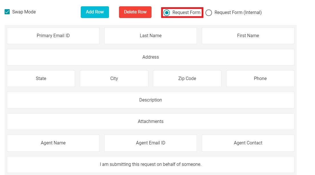
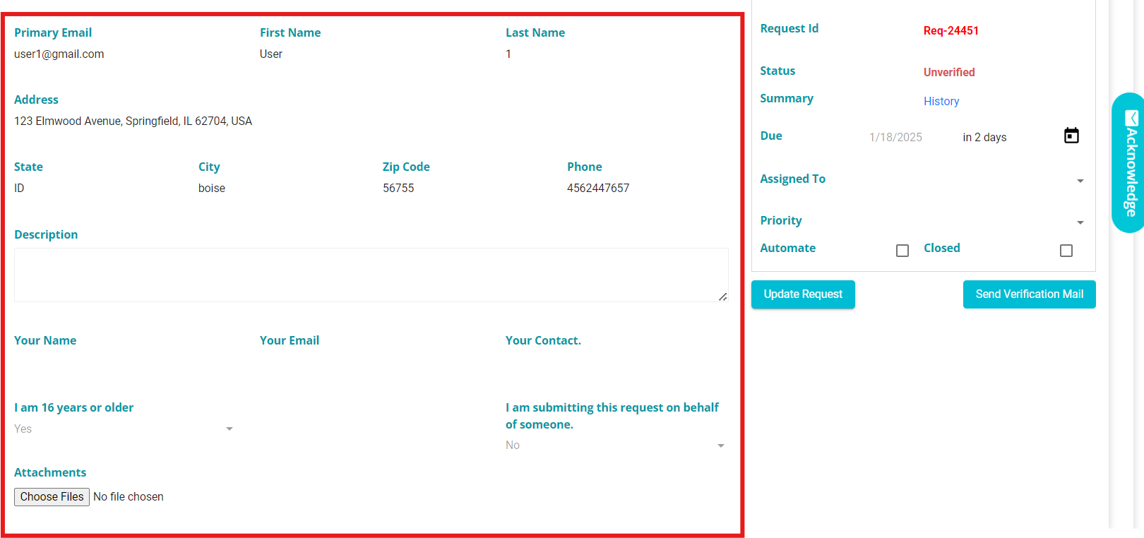
Request Form (Internal) -- when choosing this option, the changes are reflected in the internal form of the Request Form.
 Internal configuration determines how DSR
requests appear in our UI. The configuration is visible on the Request
tab screen.
Internal configuration determines how DSR
requests appear in our UI. The configuration is visible on the Request
tab screen.
Validations:
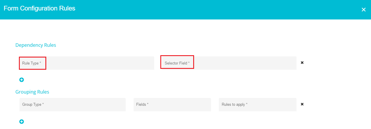
The 'Validations' button present next to the 'Display Name' box takes you to the following screen.
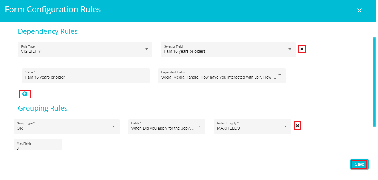
Validations are of two types - Dependency Rules and Grouping Rules. For dependency rules, you can configure the form to display specific fields depending on the option selected by the user.
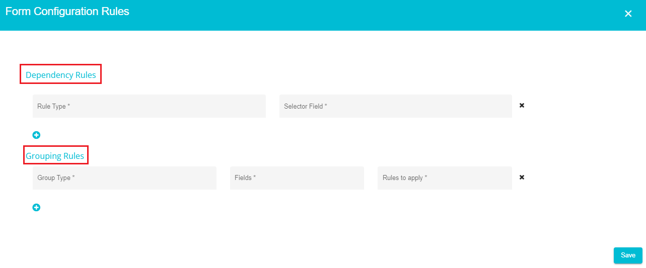
For Dependency Rules, the form would let the user provide further inputs based on the chosen option.
• Define the 'Rule Type.'
• Click on the 'Selector Field' drop-down menu and select the field to which you want to apply the validation.
Dependency rules are two types -- Required & Visible. You can configure any of these on the screen.
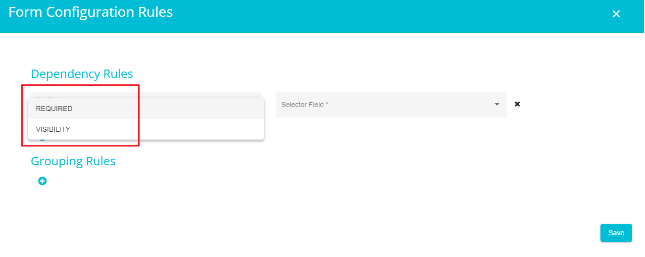
Required -- this is a required validation, meaning that the requestor filling in the form must provide the inputs to such fields.
Visibility -- these fields aren't required but are still visible on the request form. So, the requestor can choose to fill or skip such fields.
Note: Dependency Rules can only be applied to specific fields (Eg:Checkbox, Dropdown etc.) of the form and not all. The Selector Field displays all the fields to which you can apply validation, letting you choose from them. So, if you are unable to open the Selector Field drop-down, it is most likely that you haven't selected the fields that can have a validation in the request form.
- Value is automatically displayed when you select an option from the drop-down menu.
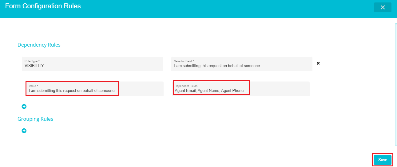
You can now select the fields that would depend on the validation that you are trying to define.
Note: Dependent fields appear on the DSA request form only when the selector field is marked (ticked/selected) by the requesters. These are like the additional information asked from the requesters based on the inputs they provide when filling the request form.
Click on the 'Dependent Fields.'
Select the required fields from the drop-down menu. You can select multiple fields from the drop-down.
Click on 'Save' to update the changes (if you don't want to add any grouping rules).
Similarly, you can define the 'Grouping Rules' for the form. These can be defined when you want to have specific information from a specific requester type. For example, if an employee is filling the form, additional information like their ID, start date, etc., are necessary (but these are only relevant to an employee), whereas you might need the information like how they applied, etc., from a candidate (specific to the candidate). In such cases, you can group certain fields that are specific to a certain requester and make them visible on the request form based on the requester's selection.
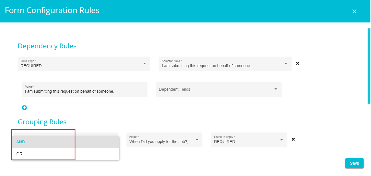
Grouping Rules are of two types -- And & Or.
And -- the rule applies to every field being selected.
Or -- the rule applies to some, or all fields being selected, based on the Rules to apply selection.
Click on the 'Group Type' option and select the required grouping rule.
Open the 'Fields' drop-down menu and select the required fields to apply validations.
Now click on the 'Rules to apply' option.
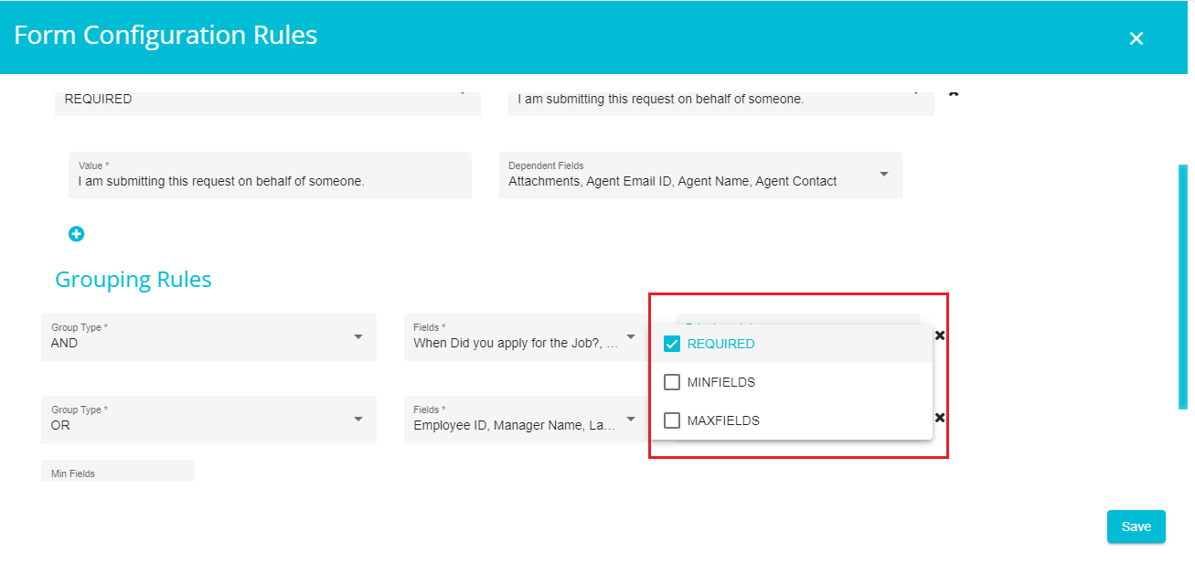
Rules to Apply configuration can be used based on what information you want from the requester. You have three options for Rules to Apply -- Required, Min fields, and Max fields.
Required -- all the selected fields will become mandatory, requiring the requestor to provide input to all the grouped fields.
Note: this configuration is appropriate for the 'And' rule, since every input field becomes mandatory, regardless of the grouping rules selected.
Min Fields -- when selecting this, you can see another option on the screen asking you to specify the minimum fields which are to be filled out when submitting the request.
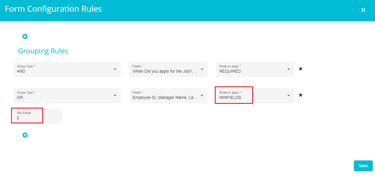
Here we gave 2 as the minimum fields, so the requester must fill at least two of the selected fields and submit the request form.
Max Fields -- when selecting this, you can see another option on the screen asking you to specify the maximum fields that a requester can fill when submitting the request.
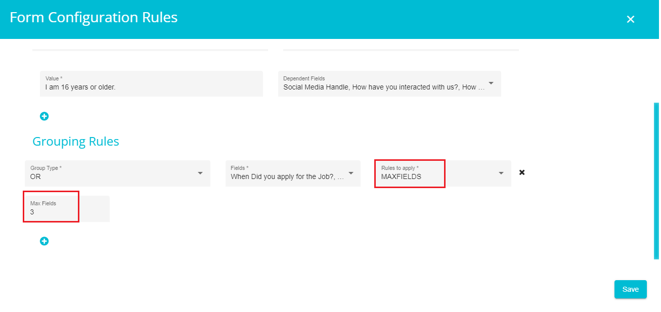
Here we gave 3 as the maximum fields, so the requester can only fill any three of the selected fields and submit the request form.
Select and configure the required rule to apply from the drop-down menu.
Click on 'Save.'
Note: Use the 'x' icon next to every rule to delete any existing rule and use the '+' icon on the screen to add new rules.
The validations you defined would be saved to the form now, and you can proceed with the other configurations.
Selecting on any of the fields displayed on the screen shows the following options to further customize the request form.
- Display Name -- shows the display name of the selected field.
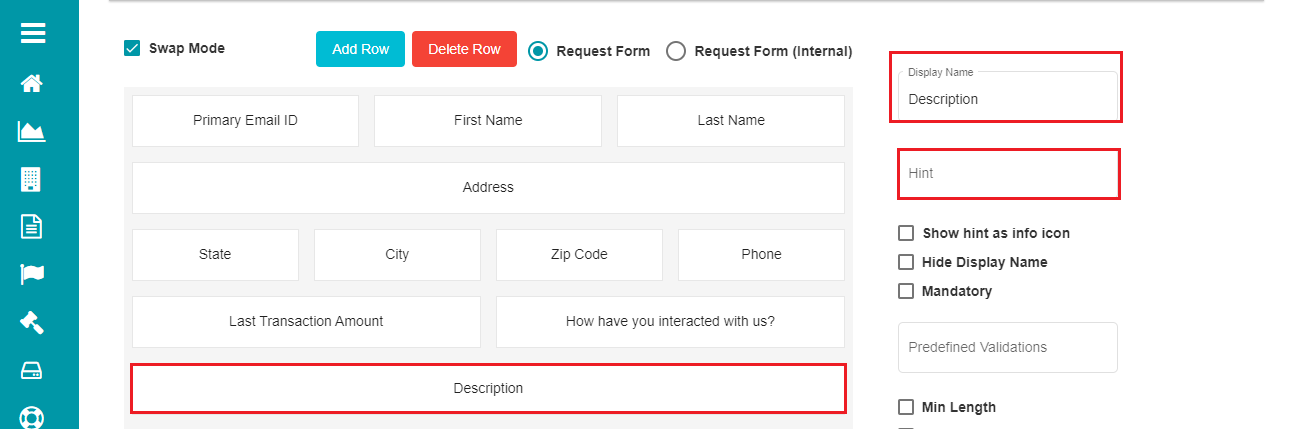
- Hint -- this option can be used to add any hint to the selected field to help the user understand more about it or what they can enter as inputs.
Whenever a hint is defined for a field in the request form, the user can see the hint message below the field. This applies to any field, not just mandatory ones, as specified by the user.
- Info Icon:
Check the 'Show hint as info icon' button.
Click
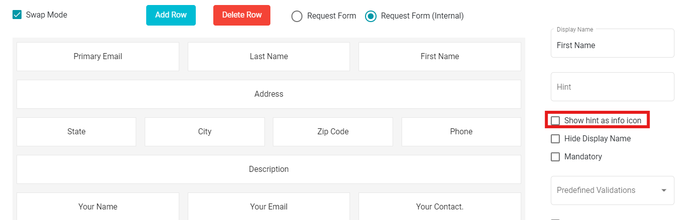
The form now shows the info icon against every field with a hint message.
- Hiding the Display Name:
In case you want to hide the display name for the selected field in a form,
Check the 'Hide Display Name' option.
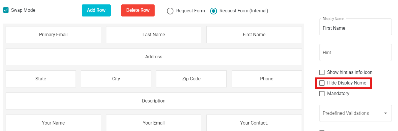
Note: Uncheck the 'Hide Display Name' option if you don't want to hide the display name for the selected field within the form.
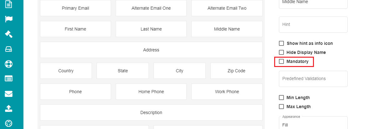
- Mandatory Fields:
When selecting this option, the user cannot submit the request form until all the mandatory fields have appropriate response.
Check the 'Mandatory' option to make a field mandatory.
Click
If you want to remove this selection for a particular field,
Uncheck the Mandatory option for that field.
Click
- Pre-defined Validations:
The users can sometimes enter invalid inputs to the request form, making it difficult to process them. In that case, some validations can be added to required fields to avoid this discrepancy. Right now, there are four pre-defined validations for the fields -- Telephone, Email, Zip Code, and none.
Telephone -- the user can only enter phone numbers on the field with this validation.
Eg: (555) 123-4567 or some other 10-digit phone number.
Email -- this validation restricts the users to enter anything apart from the email IDs.
Zip Code -- the user can only enter their Zip Code (5-7 digits) in the fields with this validation.
Eg: Beverly Hills, CA → 90210, Berlin → 10115, London → SW1A 1AA etc.
None -- This option provides no validation.
For pre-defining the validations,
- Click on any field on the form.
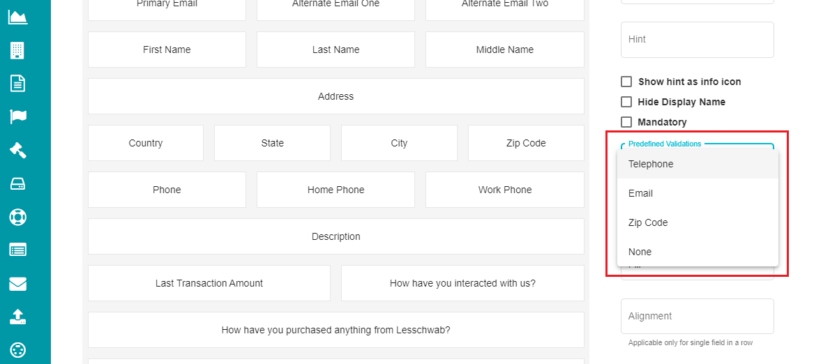
Open the 'Predefined Validations' drop-down menu.
Select the input to be validated for the specific field.
Note: If you do not want any validation for a field, you can select the 'None' option from the drop-down menu.
- Min Length & Max Length
These options can be used if the user's input should be limited to a specific number of characters for an input field.
Min Length -- checking this option would mean that the user must enter a minimum of the characters entered in this field for the selected input field.
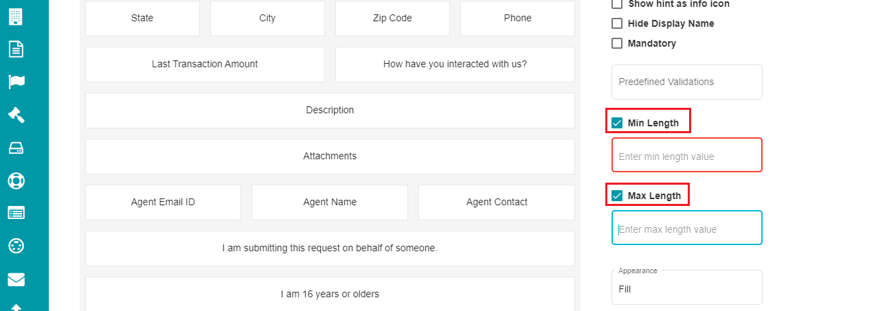 Max Length -- this option lets the user enter a maximum of the
characters defined for the selected field of a request form.
Max Length -- this option lets the user enter a maximum of the
characters defined for the selected field of a request form.
Note: Uncheck any of these options at requirement if you don't want to restrict the input characters.
- Appearance
This drop-down menu provides two options -- Fill and None. Selecting fill for any field would display a background to the field in the request form.
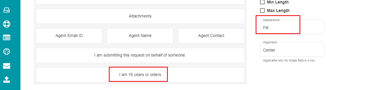
The same appears on the request form in the following way:

Note: Select None from the menu for the fields to be displayed without a background.
- Alignment
It is a drop-down menu for choosing the field's alignment in a request form. The menu provides three options -- Left, Center, and Right.
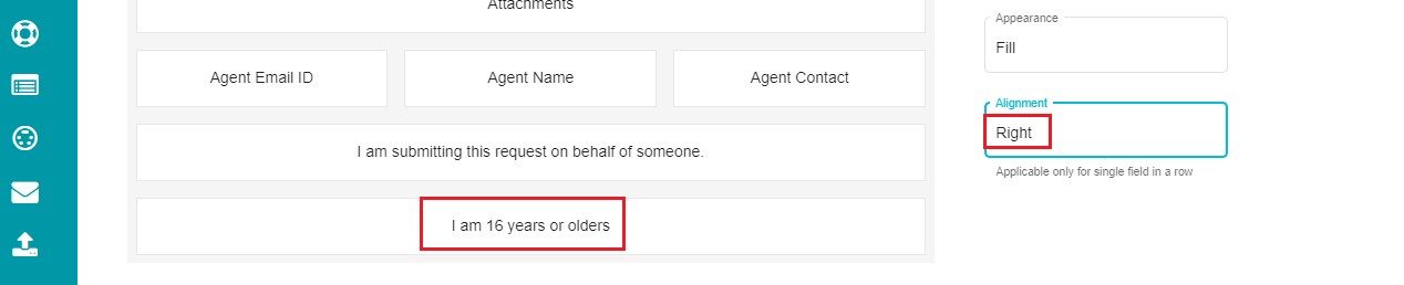
The same appears on the request form like so:

Note: Alignment option is applicable only when the entire row of the request form has a single field.
These options can be defined for every field on the request form at
requirement. It is essential that you click on the
button after making any changes for it to reflect on the request form.
Cloning a Form:
If you want a new form by slightly modifying an existing form, you can use the Clone option for it.
• Click the 'Select Form' drop-down menu.
• Select the form to be cloned.
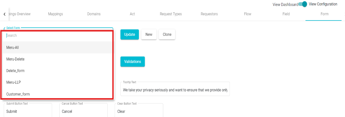 • Click on
  You can enter the Display Name, make the necessary modifications, and click on to duplicate an existing form.
Mapping the Form:
A form, after configuration, must be mapped to a domain for it to be reflected on the privacy portal's welcome screen.
For mapping the form to a domain,
Go to the DSAR Configuration homepage.
Click the 'Mappings' Tab.
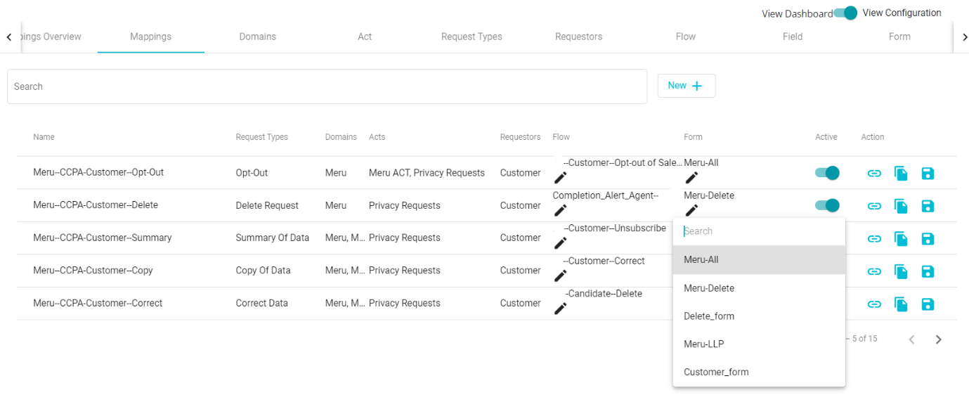
Click the drop-down menu under the 'Form' tab.
You can find the new and cloned forms in the drop-down menu along with the pre-defined ones.
Select the required form from the menu.
Check the 'Active'
 icon after making the selection.
Tap the 'Update' icon.