Survey Basic Overview/ Quick Start Guide
This page has been created as a starting point for documentation for Survey end-users.
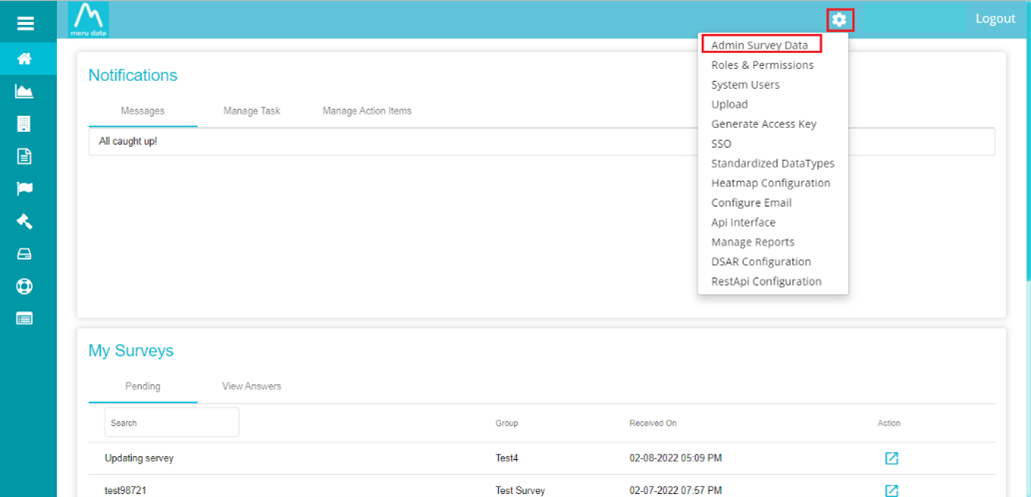
The Admin Survey Data option in the Settings menu provides access to all your existing surveys.
You will see a list of all open/closed surveys.
Survey Title: This column displays the names of the existing surveys.
Status: The Status column shows whether a survey is still open/active or has been closed.
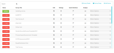
You will be able to perform the following actions on this page:
- Search: The search bar on the top of the page can be used to search for any existing survey using the survey title as the search keyword.
- Edit: The Edit option will take you to the Survey Generator where you will be able to make changes to the survey.
- Settings: The Settings button will open the Survey Configuration option where you can make changes to the notification templates and the questions in the survey.
- Quick Distribute: The Quick Distribute option is used to distribute a survey to the users.
- Analyze: The Analyze option will show the answers and distribution details of the survey.
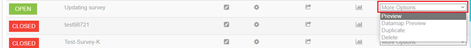
- More Options:
The More Options drop down provides the following options for a survey:
a. Preview: The Preview option generates a preview of the survey questionnaire
b. Datamap Preview: The Datamap Preview option shows the changes suggested for the attributes in the datamap based on the answers of the survey

Select the Group Name and System Name in the given fields. This will give results for the survey from that particular group related to the selected system.

Field Name shows the attribute in the data map for which the values have been suggested.
Old Value is the previous value for the attribute.
New Value is the new value suggested for that attribute.
Operation is the action to be taken for that attribute.
Answered On is the date when the answer was received.

Click Save to save the changes suggested.
c. Duplicate: The Duplicate option allows you to generate a duplicate copy of the survey.

Confirm the survey title and the date for closing the survey and click Duplicate.
d. Delete: The Delete option will delete the survey.
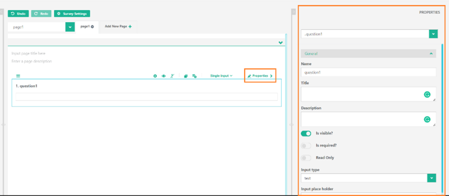
Survey Creator
The Survey Creator page has the survey design area in the middle and the Properties window on the right, with the Toolbox on the left.
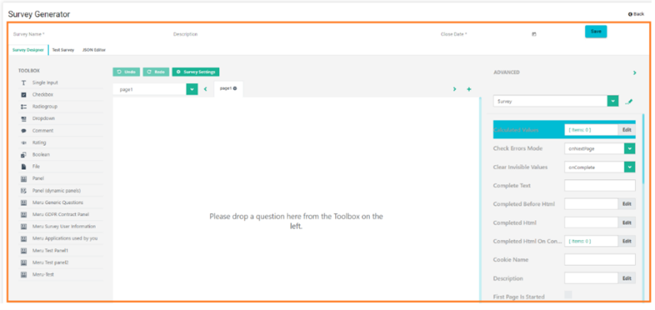
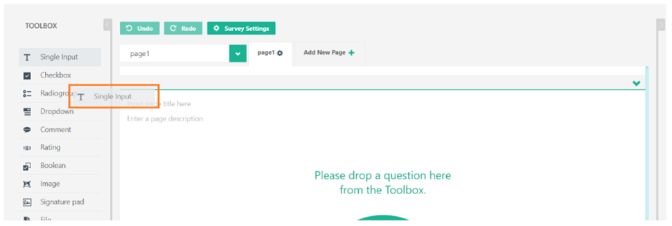
Survey elements (such as questions or panels) can be dragged and dropped onto the main design page from the toolbox (questions area).
These elements can be updated, edited, and re-ordered in the questions area to suit the needs of a specific survey.
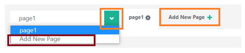
You can add pages to your survey by clicking the drop-down menu at the top left of the page.
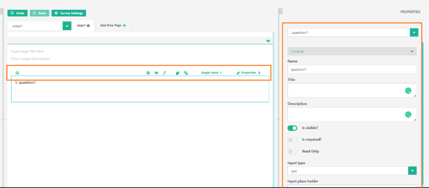
By clicking the Properties button on the right side of the screen, you can view and alter detailed properties for the entire survey as well as each individual element.
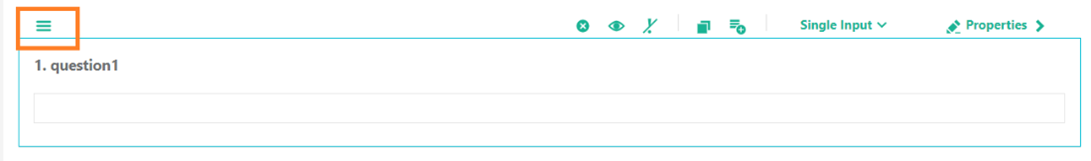
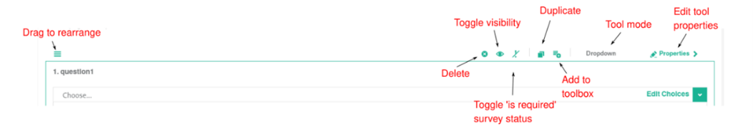
Each survey element can be ordered and re-ordered by dragging the hamburger glyph (three horizontal lines) on the top left of each element.
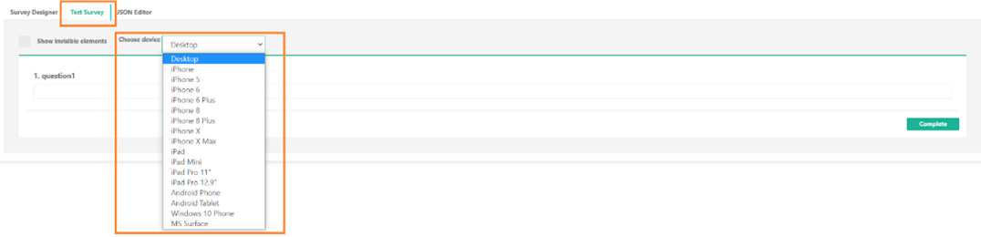
Once you've created it, you can test your survey by navigating to the top left of the Design Area and choosing the Test Survey link. You'll be able to select the target device here (for example, if you will deliver the survey via iPad, choose iPad from the drop-down list).
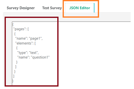
If you need to develop a more detailed survey as a JSON file, you can access the editor via the JSON Editor link at the top of the page.
Adorners
Once inserted into the Survey Creator, each toolbox item will have its own configuration panel. A series of adorners can be found on this panel.
The hamburger button (three horizontal lines) can be used to move and re-order the item, the cross button can be used to delete the item, the eye button can be used to toggle the item's visibility, duplicate the item, add the item to the toolbox, inspect the item's mode, and change the item's properties. If the tool enables it, you can additionally set the item's required status.
Individual Toolbox Elements
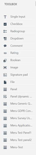
Single Input Single Input allows you to ask a simple question or request a non-predetermined input from a respondent. A single line is presented to the respondent for text input. There are no limits on the possible input, so the respondent may enter any text and any length of text.
Checkbox A checkbox allows you to distribute numerous questions or items to a respondent. A list of items with a checkbox beside each is presented to the survey responder in the Checkbox question. The item is selected when the checkbox is checked. Only those items that have been checked will be recorded in the survey.
Radio group A respondent can be asked many questions or items in a radio group. A list of items is shown to the respondent, each with a radio button next to it. Only one item from this list may be chosen, and only that item will be recorded in the survey.
Drop-down A respondent is presented a drop-down list of options. Only one of these options is available, and only that option will be logged in the survey.
Comment The Comment survey element requests a respondent's non-predetermined input. The respondent is presented with a text box. There are no restrictions on the type of input that can be provided; the respondent can provide any text and any length of text.
Rating A responder is asked to select a number from a range of options in the Rating survey element. Only one value may be chosen, and the survey will only record the value selected.
Boolean A respondent is given the option of answering yes or no in the Boolean survey element. True (yes) or false (no) will be noted in the survey as the respondent's response.

Image An image can be uploaded or connected to the survey using the Image survey feature. There is no linked value with respect to the survey.
Signature Pad Respondent input can be immediately drawn on the screen in a pre-set box or region using the Signature Pad survey feature. This is often used to acquire a respondent's signature, although it might also be used to obtain any hand-drawn input. By selecting the Properties option, you may alter the size of the box given to the respondent. You can also alter the colour of the pen and the background. The respondent's input is saved in the survey in one of three file formats: JPEG, PNG, or SVG. The Properties tab allows you to modify the file format.
File A respondent can request that a file be uploaded by clicking the Choose File button on the File survey element. When the respondent clicks the Choose File button, a web browser will open with an ‘upload file’ dialogue box. The Properties tab allows you to choose a variety of options, including the maximum file size, multiple uploads, allowed file types, and preview area. The file(s) you upload through the File element will be saved in the survey. A comma-separated set of file extensions, including periods, is used to limit file types, such as.jpg,.pdf, and.png. In the survey, the uploaded file is saved. It's critical to limit the file types that can be posted into the survey for security reasons.
Panel Panel is a survey element that acts as a box or container for several questions and sub-panels.
Panel (Dynamic Panels) You can use the Panel (Dynamic Panels) tool to create a template box or container element with numerous questions and input types. When a survey respondent clicks Add New in the survey, this template gets triggered. By continually hitting Add New, the respondent can activate any number of these templates.
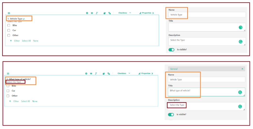
Naming an element for use in an Expression When you add a survey element, you can give it both a Title and a Name in the Properties > General section. Understanding the difference between Title and Name is important when developing the Logic for your survey. In short, Name refers to the question as a logical entity that can be refered to within the Conditional Logic of the survey without confusion. Title refers to text that is directed to the survey respondent and it may be unsuitable for use within the terse structure of the survey's logic.
An example of a Name might be Vehicle Type, while the corresponding Title might be What type of vehicle? It is clear that the purpose of the Title is to direct the survey user, while the Name refers to the question within the Logic of the survey.
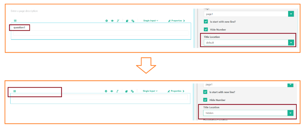
Hiding Question Number and Title in survey The Question Number and Title can be hidden in the survey output. Properties > layout > Hide number removes the number at the start of the question while retaining your Title.
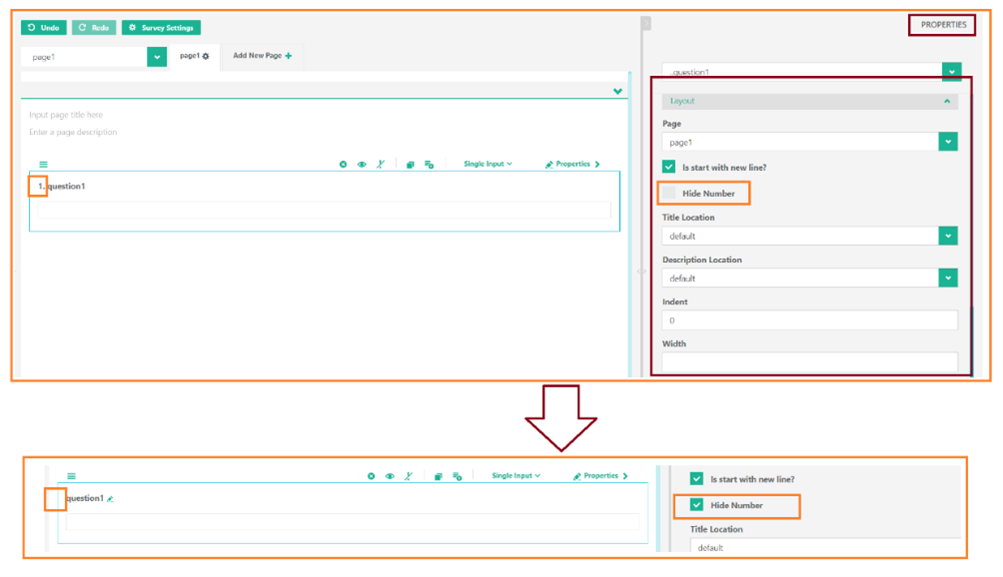
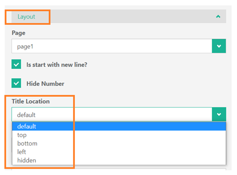
You can also remove the whole number, and title with Properties > Layout > Title location and set it to Hidden.
This can be useful if you plan to use an HTML element to ask the question or otherwise direct the survey respondent.
Formatting text within the survey The Title and Description fields of each Element can be used to partially provide text within the survey. These fields are a simple and direct approach to asking questions and providing directions to the survey respondent. While this is simple and straightforward, there are some drawbacks to using these fields. For example, formatting such as italics and bold cannot be used in an Element's Description field. These limits can be addressed by providing the appropriate textual material for your survey using an HTML element.
Conditional Logic Any question inside the survey might trigger any survey element. This enables each element's visibility or availability to be conditional on the replies given elsewhere in the survey. If a Boolean question is answered Yes, Conditional Logic will display a Matrix; if the same Boolean question is answered No, Conditional Logic will display an Image Picker. Using logic in your survey makes it more dynamic and responsive, as well as allowing you to build distinct pathways across the survey. To define the logic for each element, go to Properties > Logic.
Logic Options
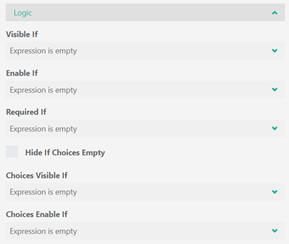
The Visible if property determines whether or not an element is made visible using Logic Expressions. If these Expressions are set, the element will be hidden until the expression criteria are met.
The Enable if property determines whether or not the element is enabled using Logic Expressions. The element will appear, but responses will be disabled until the expression conditions are met.
The Required if controls whether the element's Required state is determined through Logic Expressions. If an element is required, it becomes compulsory. The survey cannot progress or be completed until that element has received a response (the needed status can also be manually determined by toggling Properties > General > Is required).
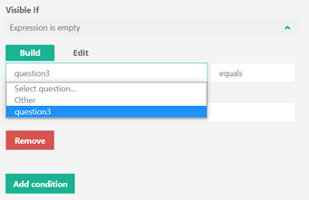
Building a Logic Expression
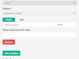
To build an element's Expression, navigate to Properties > Logic and select how you want the element to be triggered (for example, choose Visible if you would like the element to remain invisible until the conditions of the expression are met). When you choose Visible if, you'll be taken to the Select question... page. This will bring up a drop-down menu with all of the survey's available questions. These will be listed alphabetically in the dialogue.
Within the Expression, choose the question you want to use. After you've chosen your question, you'll be able to choose the Operator you want to use. Operators may include:
- is empty
- is not empty
- equals
- not equals
- contains
- not contains
- any of
- all of
- greater
- less
- greater or equals
- less or equals
Only some of these Operators may be available depending on the type of inquiry you've chosen, while others will be greyed out.
You'll be able to specify the state that the question must have to match the Expression requirements once you've chosen the question and the Operator.
For example, in the following image, if Q1 is equal to the 3rd option "Other," only then the Q2 will be shown: